Re-thinking a Craigslist Workflow Through UX
View on MediumA UX challenge focused on reducing ambiguity, improving task clarity, and modernizing a legacy workflow without overcomplicating it.

The Challenge
Craigslist’s rental posting flow works; but it carries many characteristics of older web applications: dense forms, unclear hierarchy, limited guidance, and high cognitive load.
The goal of this exercise was not to reinvent Craigslist, but to improve clarity and reduce friction while preserving its lightweight and familiar nature. Try the prototype: https://craiglistchallenge.vercel.app/
Key Friction Points
Cognitive overload
Too many fields compete equally for attention, making the workflow feel heavier than necessary.
Weak hierarchy
Important actions and optional inputs visually blend together.
Lack of guidance
Users are expected to understand formatting, sequencing, and requirements without enough contextual support.
Limited feedback
The workflow provides little reassurance that the listing is progressing correctly.
Scannability issues
Dense layouts and repetitive patterns slow decision-making
Rather than redesigning the experience visually from scratch, the focus shifted toward improving clarity, reducing friction, and preserving the lightweight nature that makes Craigslist familiar.
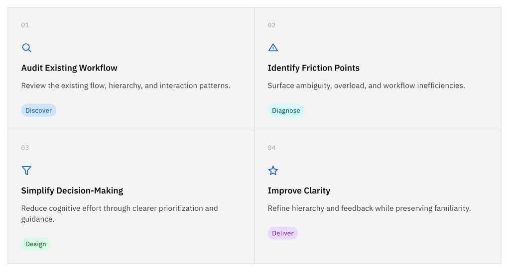
UX Improvement Process
The redesign focused on reducing uncertainty across each step of the journey. I started by auditing the existing workflow to understand its structure, identify usability issues, and surface moments of friction.
From there, I simplified decision-making by reducing unnecessary choices, improving hierarchy, and restructuring content into clearer sections. Additional revisions focused on guidance, feedback, and progressive disclosure to help users move through the flow with greater confidence and less cognitive load.

Design System Choice: Carbon Design
Since the challenge focused on workflow clarity rather than visual experimentation, I used IBM’s Carbon Design System to accelerate consistency and focus on interaction improvements.
This allowed me to:
- standardize spacing and hierarchy
- prioritize accessibility patterns
- prototype faster
- focus effort on UX decisions instead of rebuilding UI primitives
Improvement
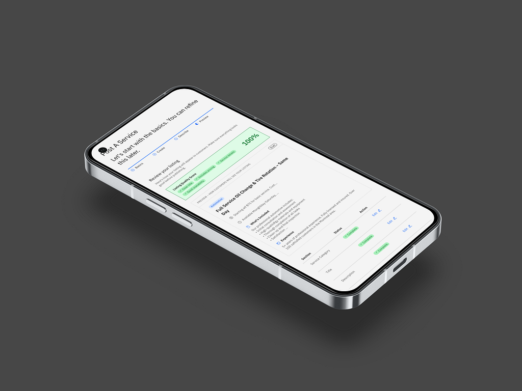
Bringing small adjustments such as presenting a clear progress path to completion, pre-populating the form leaning in user’s data aquired when account was created and using AI to assist the flow improve not only the experience but reinforces the quality of the postings helping users to produce more meaningul postings.

- Clear, persistent progress indicator to set expectations and reduce uncertainty.
- Reduced repetition by introducing the listing fee once, at the right moment.
- Explicit exit paths so users can leave the flow without feeling trapped.
- Stronger contextual guidance to support decision-making at each step.
- Clear secondary navigation to help users recover and move backward safely.
- Improved accessibility overall through better contrast, hierarchy, and structure.

Outcome
The revised flow reduces ambiguity by surfacing contextual guidance only when needed. In addition to that it brings AI-Assisted approach looking to reduce drop-offs when facing the form’s ambiguity. Auto-suggesting headings and using pre-existent data from the customer, such as location, address to pre-fill the form reduces the cognitive load and facilitates the form completion.
What This Exercise Reinforced
Crafting Ideas using an existent design system accelarates prototyping substancially.
Working on legacy-style workflows reminded me that good UX is often less about adding features and more about reducing uncertainty.
Small improvements in hierarchy, guidance, and feedback can dramatically improve how confident users feel while completing a task.
This challenge also reinforced the importance of balancing modernization with familiarity especially in products people already understand behaviorally.