Treating a Portfolio Like a Product: AI, Analytics, and Continuous Optimization.
View on Medium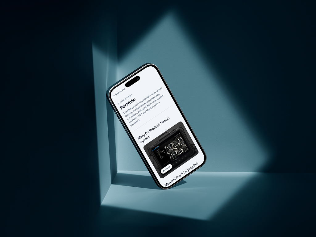
Like many designers over the last few years, I suddenly found myself needing to rebuild my online presence almost from scratch.
I didn’t begin with a carefully crafted strategy, a content roadmap, or a growth plan. Instead, my portfolio evolved organically while I searched for new opportunities, connected with other professionals, expanded my network, and explored new ways of showcasing my work.
What started as a simple portfolio quickly became much larger.
As designers, we are no longer only responsible for crafting products and experiences for others. We also need to communicate who we are, how we think, what we can build, and the value we bring in an increasingly competitive and rapidly evolving industry. Visibility has become part of the job.
Why I Built My Own Website Instead of Using a Template
Visibility has become a design problem. Recruiters, clients, designers, search engines, and AI systems consume websites differently. They are to me different audiences that need tailored content of their own. Templates are fast, but they limit control, I wanted full ownership over:
- Information architecture
- Typography
- Accessibility
- SEO
- Metadata
- Interactions
- Performance
- Responsive behavior
- Content strategy
My expectation is to have a better grip over each design decision that build my online presence so that I can elevate my understandind of what is adding and what is not.
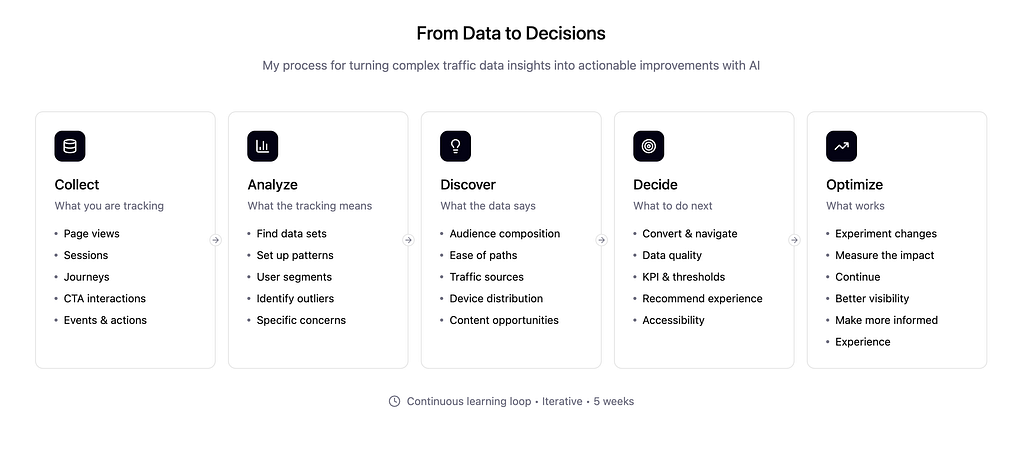
The Problem: Analytics Tell You What Happened, Not Why
I did vibe-coded the first release of my own personal website and a basic GA setup that was telling me how many visitors, which pages and for how long they were being visited but nothing about:
- Was this a recruiter?
- Was this another designer?
- Was this a potential client?
- Was this organic search traffic?
- Was this person evaluating my portfolio or just browsing?
Then I decided to create a prompt with enough context for Cursor, to help me create my GA4 tag strategy (adding events tied to tags and CTAs in my website connected to my google analytics). After that I used chat GPT to bounce ideas and help me understand the behaviours of my visitors. Path and Funnel explorations where helping to better understand my audience and identify recruiter signals.
The Website Became More Than a Portfolio
I wanted to master vibe-coding, I kept hearing about Figma MCP, Console or CLI, methods to transform your designs into tangible products. Proudly I can say I’ve tried many of them. At first I was reluctant to do it. Nowadays I spend a few hundreds montly in subscriptions trying tools that seem interesting for me.
I wanted to iterate fast using AI while being somehow in control. I learned about prompt engineering, I focused in how to make every token count. Why? because by experience I know stakeholders management takes speed at the same time than accuracy. My portfolio stopped being a showcase of past work and became a playground for future experiments.
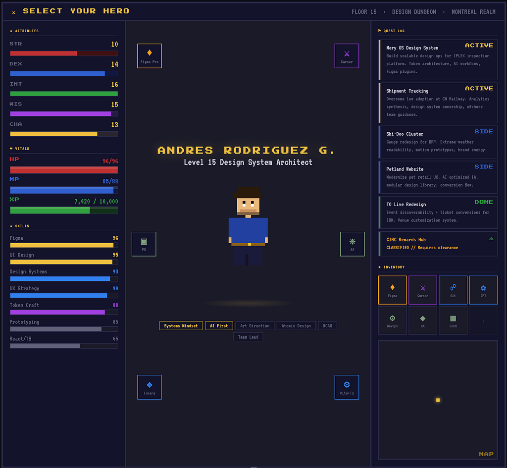
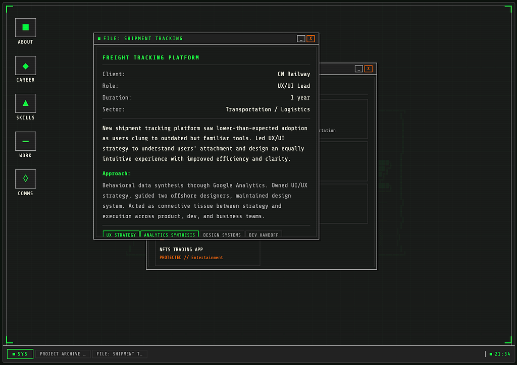
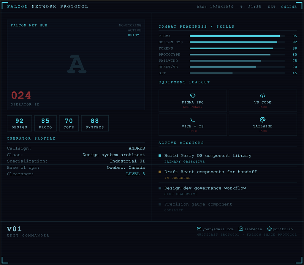
I loved those iterations exploring that videogame or military-retro explorations with Claude Code, I thought in releasing at somepoint a feature in my website that allow users to go through all those explorations. I had fun, I wish I would have more time to build my portfolio as a dungeon video game, I got inspired by an article I read in an email from Open AI, we are really at the point where our imagination is the limit.
I still need to revisit those, but as I mentioned before, I had case studies already crafted with a way more standard but still modern approach. I wanted to start somewhere, and be concious of targeting all my audiences not only designers. My content has to be easy to consume and varied enought to show all the nuances of my work.
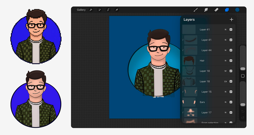
With these days where avatars are very standard, I wanted to have one out of my own sketches. It started as a quick draft in a piece of paper that I traced in Procreate and added a bit of colour, I polished a bit using Figma. Then I had fun exploring pixel art variations with GPT.
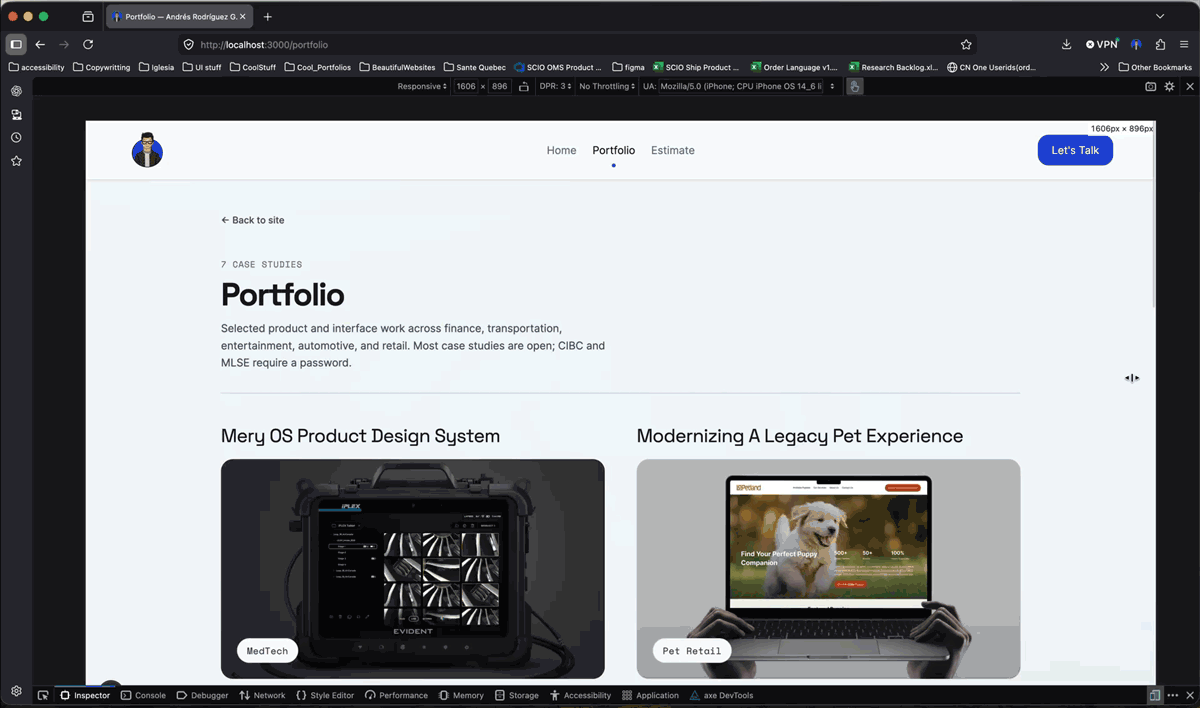
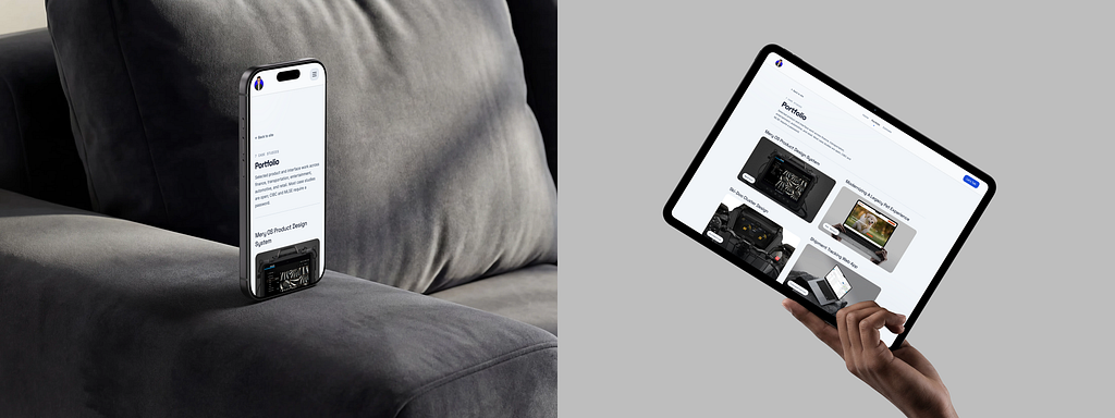
Achieving a consistent experience across devices required continuous validation of typography, hierarchy, spacing, and accessibility. Browser inspection tools helped verify each breakpoint individually, while newer AI-powered testing tools can now automate much of that process across multiple screen sizes simultaneously. In regards of tooling that facilitates this process I’ve explored https://polypane.app/ or https://responsively.app/
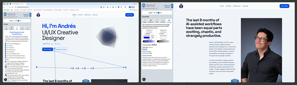
I wanted to validate my website from every angle, and accessibility could not be an afterthought. Throughout the process, I audited the site using tools such as Lighthouse and WAVE, continuously refining typography, hierarchy, contrast, and navigation patterns to find the right balance between usability and visual design.
Accessibility is a topic I care deeply about, not only as a designer but also as someone who is color blind. Thanks to accessible products and inclusive design practices, I’ve been able to use professional design tools throughout my career without barriers. My experience has also taught me that many common assumptions about color blindness are inaccurate.
Color-blind people do see color, often thousands of colors. The difference is that some color distinctions and subtle variations are perceived differently. I often compare it to the difference between display technologies: some people can detect nuances that create a richer color experience, while I rely more heavily on contrast, hierarchy, shape, motion, texture, and context to interpret information.
Rather than viewing this as a limitation, I see it as a perspective that has strengthened my approach to design. It has made me more intentional about creating experiences that do not depend solely on color to communicate meaning. Given the right environment and an inclusive team, diverse ways of perceiving the world become an advantage, helping uncover accessibility issues and opportunities that might otherwise go unnoticed.
Optimizing the Experience Like a Product Designer
Evaluating the performance of the navigation, testing the funnel analysis and the visitors journey to understand the expected behavior was taking place for homepage, case studies and articles (Landing Page ->Next Page
-> Next Page ->Exit).
As part of my strategy I decided to split my content in two main areas, ‘work’ or ‘portfolio’ and ‘articles’ a section where I wanted to showcase, experimentation while demonstrating my skills at the same time, somehow an informal version of portfolio.
This laboratory has turned into a insighful tool that demonstrates how design decisions translate into real conversions.
Insight 01: My Portfolio Isn’t Being Discovered. It’s Being Evaluated.
Most visitors arrive through direct and referral channels rather than search engines, suggesting the website currently functions as a validation tool for recruiters and professional contacts rather than a discovery engine.
Insight 02: Visitors Came for the Work, Not the Story.
Visitor journeys consistently move from the homepage directly into portfolio work, revealing that people are primarily interested in evidence of capability rather than personal narratives.
Insight 03: The Most Niche Project Generated the Most Interest.
My most technical case study generated the highest engagement, suggesting that depth of expertise creates more curiosity than broad generalization.
Building an AI-Powered Layer on Top of Analytics
Answering the right questions:
- Which page attract recruiters?
- Which journeys are most likely associated with hiring managers?
- Which portfolio projects generate the longest engagement?
- Which devices experience the highest abandonment rates?
Optimizing for Humans, Search Engines, and LLMs
For the first time, websites are being consumed not only by humans and search engines, but also by AI systems that help humans discover information.
I am optimizing my website for clear hierachy, engaging content, short paragrapgs easy to read. Assuring every piece has its metadata counter part so that is well indexed, making sure performance is under the good practices. Structutured case studies, consistency is king. I. re-build one by one every case study making sure it includes a clear process that shows my skills but also the way I think, my collaboration model, and the outcomes.
Interenstigly, to this point I haven’t asked to LLM’s about myself, so I did it and the results were very insighful, I encoraudg you to try it as well, being able to gather some real feedback, in my case the alignment between my resume and my linkeding profile. Subtle things were showing signs that could be missinterpreted by AI. Solving that was part of the process.
What I Learned
The biggest lesson wasn’t learning how to use AI. It was realizing that my portfolio behaves like any other product. It has users, journeys, friction points, engagement patterns, and opportunities for improvement.
Next Steps: Rewriting headlines, improving CTA’s, reestructuring case studies, prioritizing work over branding to optimize performance, increase engagement and reduce bounce and abandonment rates.
AI helped me analyze the data faster, but the real value came from asking better questions and translating observations into design decisions.
Every visit, click, drop-off, and interaction became feedback. Every insight became a design decision.